Tuesday, 24 June 2008
Sunday, 22 June 2008
fffound on fffound


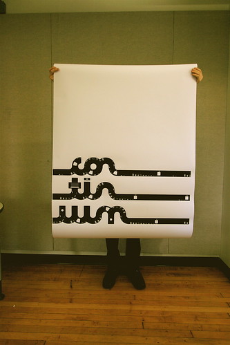
Amsterdamer
Typeface inspired by a visit to
Amsterdam. Inspired by and developed
from traffic signs found on herringbone
street paving.(simon gladstone)

A1 screenprinted / double-sided poster.


Friday, 6 June 2008
BUZZ IT EVALUATION
 SHOWstudio: Downloads: Mobile Phone Videos
what have i learnt about myself?
-Im easily distracted and my mind works in short sharp bolts rather than long drawn out prose this is why i have written this evaluation in bullet points.
- I am incredibly indecisive
-I am not as good as i think i am
-I am most happy when playing with design rather than working with it.
-I try to be to clever.
-I let graphics take over my life, i become obsessed with it, it becomes my everything. I become to wrapped up with it and forget about everything else, this is wrong, i should as shaugnessy says become more "culturally aware", this will give me something something else to be passionate about other than graphic design.
-While at an exhibition of posters from the student revolution of '68 in paris, i realised that i really want a revolution to happen, a massive social would make me feel like my life meant something, that i wasnt just one of the million art and design students hoping to succeed in a rapidly saturating design industry.
-I have learnt that organisation and time management etc mean little when trying to find a job or get a placement. Interviewers do not care whether you know exactly what your doing each and every hour of the day. All they really care about is whats in your portfolio. Although i'm not trying to undermine the importance of these attributes to a designer i do think that i have concentrated on these areas far to much rather than concentrating on who i am as a designer, and what I am happy doing.
-I am in control of my life, no one else is.
-
What have i learnt about my design practice?
-I do too much research
-I have realised that i should use research to further my ideas, and that it should fully synthesise with my work.
- I delve into the research so far that my projects become research projects rather than design projects,
- I should get stuck into design and use visual thinking to further the development of my work.
-that a system that is too structured gives structured and systematic results, so that work becomes to similar. I have learnt that my design practice should be fluid and and organic and not a taylorist regime.
-when at an interview with graham fink he said that there should be more of my soul into graphic design, this confused me at first,"my soul?! what the hell do you mean my soul?!" but as this statement has mulled over in my mind it has started to make more sense. I have now realised that it has to come out of me through doing it rather than thinking about what it is.
- I am to quick to work out why my ideas dont work rather than how they could work.
- I should design first think later.
-Complicated is not clever, simple is better.
-i over complicate things far to quickly, i get so wound up in the project i forget to stand back and trully evaluate whether it is working, i expect other people to understand it because i do.
-I have realised that i have done almost no posters at all. I have always tried to keep away from them, because i have believed that it is a tired format(everybody does posters), but now when putting my portfolio together that posters are not tired and that thee be so much done within the limitations of a poster.
- i have learnt that i need limitations they give me something to evaluate my work against. they give me a specification to work too, a clear set of boxes that the project has to forfill. So next year i will set myself limitations.
- i need to find my own place in the industry and this will only come through understanding what the possibilities are.
- realistically i need someone else to make decisions for me, to keep me line to stop me wondering off into my own mind.
-I have developed a basic understanding of quark, after affects and flash, i now know the limitations and possibilities of these programs.
-Working with flash has enlightened me on how to create depth using perspective in a 2d screen.
- i have developed an understanding of sequential design.
- i have developed presentation skills but these need improvement still.
- i need to put more time into the craft of my ideas.
- i am confused about where i fit into the industry or where i am going as a designer. really i am unaware of the possibilities. realistically i would want to work in a small studio and not a massive agency, but this is as far as it goes. realistically i do not want to work in a design factory.
-Working collaboratively meant that we were able to cross evaluate what we were doing. I realised that we must work individually within the group on different tasks to make the most out of the creative partnership. Although we found it difficult to make decisions at some points we generally agreed on a lot of the key points.
-I have learnt about the limitations of print production and how to use these as a starting point or as a constant consideration for design.
-I have learnt of the different printing methods such as offset lithography, flexography, dye sublimimation, letterpress, heatpress, spot colour and cmyk process colours. I have learnt what the advantages of these processes are and their different applications.
-I have learnt how to setup my artwork for print production, using illustrator, photoshop and In design.
-I have realised that some print techniques are appropriate for different formats such as packaging or posters to cut down on cost of printing, but I have also learnt that this should not been seen as a limitation but an opportunity for design development.
-I have learnt of the visual gamut and the range of different colours that aren’t available in the cmyk gamut, but I have also learnt how to achieve these colours using spot colours.
-Spot colours have shown me how I can achieve print finishes such as gloss varnish or lumo.
-I have developed the use of printing methods such as monotone and duotone to create continuity. Utilising the constraints of these two methods to create striking design to capture attention.
-One of the main things that I have learnt through this module is using the limitations of print, and how to constantly keep the limitations in mind throughout design.
-I have also learnt how to alter and develop ideas so they can work in different processes. I.e changing an idea from full colour to black and white. I have also Learnt how to make use of this to further my design, e.g.using negative out on black and white, to highlight specific areas.
Thursday, 5 June 2008
BIBLIOTHEQUE
 Bibliotheque
Identity for a small studio producing sound design
and music. A limited budget and the need to package
a large number of formats informed our solution.
A multi-purpose letterhead was designed to be cut
and folded along pre-printed keylines and scores,
to create the appropriate media insert. Supported by
a single sheet of labels the end result meant that
all formats were covered by a single letterhead, mini-
mizing cost and waste.

Identity and promotional material for a wind-powered installation on London’s South Bank, promoting sustainable energy, sponsored by Shell. The symbol
is based on a kinetic abstraction of the wind turbine which powered the event. A series of posters were produced using a range of coloured papers to provide maximum impact within a restricted budget.


"We were approached by Adrian Shaughnessy of This is Real Art, to get involved in a project encouraging new subscriptions to Creative Review. Six design studios were asked to rethink an 'everyday design'. We chose London’s street signage – which is in a dire state. Whilst we cannot claim to be able to solve a problem of this magnitude
in a small project such as this, we could at least provide some ideas.


