Thursday 18 October 2007

EMERY

Environmental design is an interest to mine because it exists off the page, out of the book, of th e web, it has physical presence. It can coexist with human presence or be there to block or provoke human existence. It is a completely different medium, it is where the idea takes hold.


i like the simplicity and easy navigation of this website it forces you to remember the name and logo of the company by using it as the main fous of the site for navigation.
WEBSITE
http://www.emerystudio.com/es_flash.htm

Dry UK

Dry design are interesting design group, they try to think outside of the box and come up with innovative campaigns. ideas based, concept based original campaigns. They come up with a concept a campaign concept then the apply this to create a range of different outcomes. Theyre work encompasses the realms of environmental design, marketing, art direction, campaign management. They're work doesn't rely on a particular format, they don't use a particular tool in the way of typography, illustration, digital media. theyre given a brief and they react to it using tools that are appropriate to the task whether this be poster, environment design, shop design.

Theyre client list tends to go towards clothing and youth culture enterprises. This i think has given them creative freedom because these brands have to be seen as being creative, they have to offer up a brand identity of being fun and exhillerating.

theyre client list

Firetrap
fatface
habitat
office
highbury college
ben sherman
bowery
wrangler
dead teen
lee jeans
sprite


http://www.dry.uk.com/


Old store infected with furniture eating spots

initial concept drawing

pre launch staff t shirts
POST LAUNCH 48 SHEET BILLBOARD FEBRUARY 2007
ENCHANTED HELPER
ENCHANTED BEDLAM MORRIS FOLK AT THE LAUNCH EVENT
ENCHANTED WINDOW


The dry team were asked to create a campaign that would encompass the closure of the old store and the launch of the new store. They decided that the old store would contract a spotty furniture eating disease which would slowly grow week by week until the whole store including the furniture were consumed with large swirls and dayglo spots. The furniture, being adverse to the disease would morph into creature hybrids with wings and feet and flee to the new store. "we wanted to captivate the loyal habitat shopper while engaging the new, to havethem enter a world of wonder, spectacle and theatre.

Dry took this idea and applied it to a range of different mediums.

Instore disease installation
3d hybrid furniture sculptures
ads
guerilla magnet campaign
pre and post door drops
launch day event
enchanted little helpers with giveaways
enchanted white horse and carriage
silver tuk-tuks
enchanted nibbles
dark enchanted morris men
mettallic balloons
diseased tees
enchanted tees and hoodies

Wednesday 17 October 2007


"Client
AVA Publishing

Project
Inspiring Creative Web Design Book


"Specialist publishers AVA commissioned us to art direct this book, which focuses on the creative side of the Internet. The design of each page is illustrated with, and influenced by, some of the experimental online art and stunning web graphics shown within the book."

http://www.them5.com/framework/index.html

interesting interactive website. by designers republic.

Greyscale


Found this while researching greyscale prinitng. Interesting conjunction of type with image and type as image.


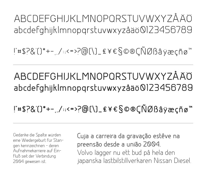
This was a free typeface offered on the website, it offers great clarity and simple beauty. through curvaceous strokes and large counters.

I particularly like the abstract typeface used below. it almost seems to refer to folded paper, or origami.


this really simple composition works well. The flowing lines and tonal graduation of the photograph brings you to the bottom of the image taking you past the title "book". The type also seems to mirror some aspects of the photograph with flowing lines and simple forms.


Tuesday 2 October 2007

vicious 5 video


interesting combination of video, drawing and animation.

this video was created by distributing 40 frames of the video to different designers and illustrators for them to draw over how they please. this gave the designers 2 seconds of footage to treat how they please. this gives the video an eclective mix of styles and manipulations that changes every two seconds. but also keeping continuity throughout with the retainment of the main performer.

Thursday 14 June 2007


nice typography

Wednesday 6 June 2007

8grad.

8grad


Interesting style. none literal but still with realistic attitudes.

critical journal- faile


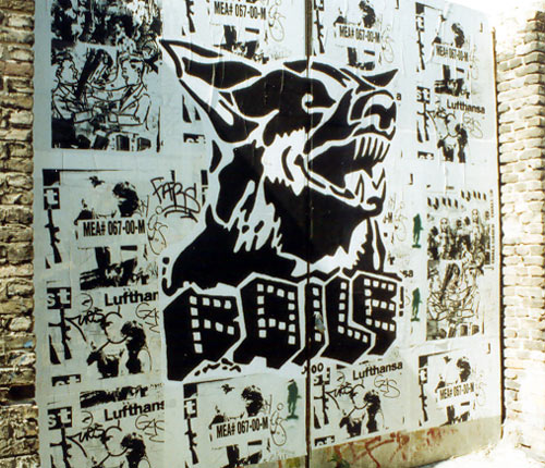
This is failes instantly recognisable logotype. That is visible in the majority of their work.


Faile is a collective of artists and designers from new york they established themselves in 1999 in new york. They started out doing paste ups of screen printed posters. They then moved on to stencil sprays. They have similarities to pop art by using visual languages from 80s pop culture. Their images have similarities to adverts in american childhood magazines selling things like xray goggles.

“Faile was about this growth process. About taking your fears and your challenges, your grief and misfortune, and creating something from that. Taking your failures and proceeding forward, becoming stronger from what you have learned…The name has a meaning that is dear to us, something that is born out of a place and time for us, and something that has a philosophical undercurrent that flows through the work we do."

faile was set up by three people patrick mcneil, patrick miller and Aiko Nakagawa

They set themselves up as a collective and they intended to work as one.

“We were always interested in the idea of an art group, similar to a band but as visual artists. Something where the work could really be made through the collaborative process, where it is a result of everyone's combined efforts. It gives us the ability to riff off each other and really be influenced by our work together. This is something Pat and I grew up with, and as that idea was really starting to come together, Aiko came into the picture and it just seemed to all make sense.” - McNeil

they set out to try and dominate as many cities as they could to try and establish a name, a title. To get a wide distribution and recognition. the collective started pasting up pieces in all cultural centres of the world such as london, paris, amsterdam, berlin, barcelona, copenhagen and tokyo. The collective started the project as a student using their student loans to travel and paste up their work.

After 4 years of pasting and painting the group started to get commisions for murals, fashion, music videos and photography. They delved into fashion by applying what they were doing on a street to tshirts, shoes, theyve even done a limited edition faile shower curtain. Their approach and way of making money is the same as obeys.


Collaboration is at the heart of failes concept. The three artists styles complement each other.
"Our process of creating work involves synthesizing images to create visually visceral experiences, very similar to the way a DJ samples beats to create an audible experience." - McNeil

Dualism is also a major aspect in failes work with juxtapositions such as "sinful pleasures", perils and paradise, a picture of prince charles with the slogan perfect.

recently faile has started multilayering their images. It seems that they take inspiration from the street. nby repeatedly pasting up then ripping down. This gives the images a collage effect that eminates the effect of multiple flyposting.

Faile themselves have cited the artist Robert Rauschenburg (a pre pop-art artist who often used found objects and was a prolific screen printer), Stanley Kubrick (famed for his classic imagery), Andy Warhol, Cy Twombly and Roy Lichtenstein as influences and you can see this coming through in their work. Espescially the work of Roy Lichtenstein with the comic book style to the characters in their work.

Sunday 27 May 2007


THE BILLBOARD LIBERATION FEDERATION. Art activists that thou to fight back against the mass corporation advertising machine. They fight back by liberating billboards from persecution of being used as a tool to sell products to the innocent public.

They do this by altering existing billboards. They aim to poke fun at the advert or the company, demeaning theyre advert. The billboards are not instantly recognisable as being altered but with further reading you can tell that words have been changed to obstruct and change the message of the adverts to that of something comical.


THEIR MANIFESTO The BLF Manifesto In the beginning was the Ad. The Ad was brought to the consumer by the Advertiser. Desire, self worth, self image, ambition, hope; all find their genesis in the Ad. Through the Ad and the intent of the Advertiser we form our ideas and learn the myths that make us into what we are as a people. That this method of self definition displaced the earlier methods is beyond debate. It is now clear that the Ad holds the most esteemed position in our cosmology.
  • Advertising suffuses all corners of our waking lives; it so permeates our consciousness that even our dreams are often indistinguishable from a rapid succession of TV commercials.

  • Different forms of media serve the Ad as primary conduits to the people. Entirely new media have been invented solely to streamline the process of bringing the Ad to the people.

  • Old fashioned notions about art, science and spirituality being the peak achievements and the noblest goals of the spirit of man have been dashed on the crystalline shores of Acquisition; the holy pursuit of consumer goods. All old forms and philosophies have been cleverly co-opted and re"spun" as marketing strategies and consumer campaigns by the new shamans, the Ad men.

  • Spiritualism, literature and the physical arts: painting, sculpture, music and dance are by and large produced, packaged and consumed in the same fashion as a new car. Product contents, dictated by trends in hipness, contain a half-life matching the producers calender for being supplanted by newer models.

  • Product placement in television and film have overtaken story line, character development and other dated strategies in importance in the agendas of the filmmakers. The directors commanding the biggest budgets have more often than not cut their teeth on TV Ads & music videos.

  • Artists are judged and rewarded on the basis of their relative standing in the ongoing commodification of art objects. Bowing to fashion and the vagaries of gallery culture, these creators attempt to manufacture collectible baubles and contemporary or "period" objects that will successfully penetrate the collectors market. The most successful artists are those who can most successfully sell their art. With increasing frequency they apprentice to the Advertisers; no longer needing to falsely maintain the distinction between "Fine" & "Commercial" art.

  • And so we see, the Ad defines our world, creating both the focus on "image" and the culture of consumption that ultimately attract and inspire all individuals desirous of communicating to their fellow man in a profound fashion. It is clear that He who controls the Ad speaks with the voice of our Age.

  • You can switch off/smash/shoot/hack or in other ways avoid Television, Computers and Radio. You are not compelled to buy magazines or subscribe to newspapers. You can sic your rotweiler on door to door salesman. Of all the types of media used to disseminate the Ad there is only one which is entirely inescapable to all but the bedridden shut-in or the Thoreauian misanthrope. We speak, of course of the Billboard. Along with its lesser cousins, advertising posters and "bullet" outdoor graphics, the Billboard is ubiquitous and inescapable to anyone who moves through our world. Everyone knows the Billboard; the Billboard is in everyones mind.

  • For these reasons the Billboard Liberation Front states emphatically and for all time herein that to Advertise is to Exist. To Exist is to Advertise. Our ultimate goal is nothing short of a personal and singular Billboard for each citizen. Until that glorious day for global communications when every man, woman and child can scream at or sing to the world in 100Pt. type from their very own rooftop; until that day we will continue to do all in our power to encourage the masses to use any means possible to commandeer the existing media and to alter it to their own design.

  • Each time you change the Advertising message in your own mind, whether you climb up onto the board and physically change the original copy and graphics or not, each time you improve the message, you enter in to the High Priesthood of Advertisers.

Jack Napier
John Thomas.

(http://www.billboardliberation.com/manifesto.html)

The website is setup like a corporate website. Mimicing things such as "Our Mission", " Clients", "strategic partners", "history" "corporate". The site even has mock corporate photos of people in masks that im sure ive seen in some heist film.


The website is a recruitment site for new commercial activists. They offer instructions on how to be a billboard saver with a page entitled "The art and science of billboard improvement" which gives instructions on selecting the right billboard through to specific instructions on creating the alterations and ensuring the security of yourself.


Very interesting stuff. Seems very similar in thesis as Adbusters.


Friday 25 May 2007

patrick shanahan esparantis.

These images are almost seductive with their glowing quality. The images are taken at night with a long shutter speed. This causes vivid images with the night almost glowing

This image has asense of eerieness . With the car park having a feeling of being deserted.
The photos offer an insight into european contempory urban landscape


Thursday 24 May 2007

smoke free campaign


this was a flash popup on the internet caught my eye with fast moving graphics. interesting.

pedro semeano

WAS flicking through joelys musa book while waiting for my tea to brew. theres some interesting illustrations. i particularly liked the work of pedro semeano.
His work has great similarities to david foldvaris work With the amount of whitespace, markmaking and composition.

Tuesday 22 May 2007