Tuesday, 20 May 2008
Sunday, 4 May 2008
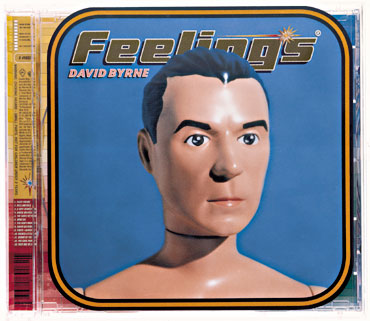
sagmeister
SAGMEISTER(GENIUS)


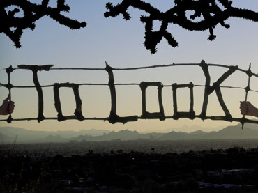

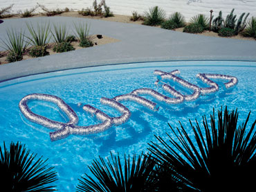

i cant see the relation to they type and the image that they are in. I cannot see how the image relates to the message. Although i do like the integration of the type into the environment.
these images form a series called "things i have learned in my life so far" that are collated into a book(see below)
this book is based on a list of maxims made by the graphic designer on his “experimental year” in 2000, where he took time out from working on commercial projects. While the maxims read as a mixture of wise pragmatism with philosophical reflection, they quickly became incorporated into projects for clients when Sagmeister’s office reopened, and it is 20 of these projects that form the book.


a spin off from this is a great website (http://thingsihavelearnedinmylife.com/) which is a website where people are able to upload their own "things they have learned".


some are more succesful than others. The simpler ones work best, and so do the ones that combine the image and the type.

SAgmeister goes for the big idea, but i dont think that the message is always crystal clear. He generally picks up on a detail in what the graphic is for and uses this to create a simple idea that has integrity. i.e. the above poster uses cofee cups. picking up on the point that many design students drink alot of coffee.
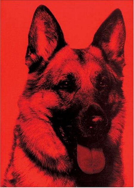
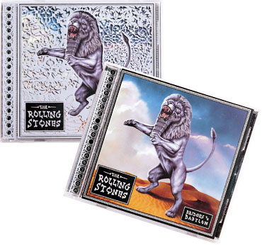
another idea that interested me that i found in his book "made you look" . It was an album cover for a band. the album was called scratch, so he used sandpaper for the album insert, the sandpaper would then slowly scatch the plastic jewel case.


i cant see the relation to they type and the image that they are in. I cannot see how the image relates to the message. Although i do like the integration of the type into the environment.
these images form a series called "things i have learned in my life so far" that are collated into a book(see below)
this book is based on a list of maxims made by the graphic designer on his “experimental year” in 2000, where he took time out from working on commercial projects. While the maxims read as a mixture of wise pragmatism with philosophical reflection, they quickly became incorporated into projects for clients when Sagmeister’s office reopened, and it is 20 of these projects that form the book.
a spin off from this is a great website (http://thingsihavelearnedinmylife.com/) which is a website where people are able to upload their own "things they have learned".
Sagmeister’s full list of 20 maxims are as follows:
1. Helping other people helps me.
2. Having guts always works out for me.
3. Thinking that life will be better in the future is stupid. I have to live now.
4. Organising a charity group is surprisingly easy.
5. Being not truthful always works against me.
6. Everything I do always comes back to me.
7. Assuming is stifling.
8. Drugs feel great in the beginning and become a drag later on.
9. Over time I get used to everything and start taking for granted.
10. Money does not make me happy.
11. My dreams have no meaning.
12. Keeping a diary supports personal development.
13. Trying to look good limits my life.
14. Material luxuries are best enjoyed in small doses.
15. Worrying solves nothing.
16. Complaining is silly. Either act or forget.
17. Everybody thinks they are right.
18. If I want to explore a new direction professionally, it is helpful to try it out for myself first.
19. Low expectations are a good strategy.
20. Everybody who is honest is interesting.
some are more succesful than others. The simpler ones work best, and so do the ones that combine the image and the type.
SAgmeister goes for the big idea, but i dont think that the message is always crystal clear. He generally picks up on a detail in what the graphic is for and uses this to create a simple idea that has integrity. i.e. the above poster uses cofee cups. picking up on the point that many design students drink alot of coffee.
another idea that interested me that i found in his book "made you look" . It was an album cover for a band. the album was called scratch, so he used sandpaper for the album insert, the sandpaper would then slowly scatch the plastic jewel case.

Subscribe to:
Posts (Atom)