Thursday, 14 June 2007
Wednesday, 6 June 2007


critical journal- faile
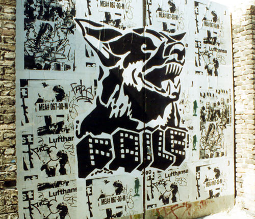
This is failes instantly recognisable logotype. That is visible in the majority of their work.


Faile is a collective of artists and designers from new york they established themselves in 1999 in new york. They started out doing paste ups of screen printed posters. They then moved on to stencil sprays. They have similarities to pop art by using visual languages from 80s pop culture. Their images have similarities to adverts in american childhood magazines selling things like xray goggles.
“Faile was about this growth process. About taking your fears and your challenges, your grief and misfortune, and creating something from that. Taking your failures and proceeding forward, becoming stronger from what you have learned…The name has a meaning that is dear to us, something that is born out of a place and time for us, and something that has a philosophical undercurrent that flows through the work we do."
faile was set up by three people patrick mcneil, patrick miller and Aiko Nakagawa
They set themselves up as a collective and they intended to work as one.
“We were always interested in the idea of an art group, similar to a band but as visual artists. Something where the work could really be made through the collaborative process, where it is a result of everyone's combined efforts. It gives us the ability to riff off each other and really be influenced by our work together. This is something Pat and I grew up with, and as that idea was really starting to come together, Aiko came into the picture and it just seemed to all make sense.” - McNeil
they set out to try and dominate as many cities as they could to try and establish a name, a title. To get a wide distribution and recognition. the collective started pasting up pieces in all cultural centres of the world such as london, paris, amsterdam, berlin, barcelona, copenhagen and tokyo. The collective started the project as a student using their student loans to travel and paste up their work.
After 4 years of pasting and painting the group started to get commisions for murals, fashion, music videos and photography. They delved into fashion by applying what they were doing on a street to tshirts, shoes, theyve even done a limited edition faile shower curtain. Their approach and way of making money is the same as obeys.
Collaboration is at the heart of failes concept. The three artists styles complement each other.
"Our process of creating work involves synthesizing images to create visually visceral experiences, very similar to the way a DJ samples beats to create an audible experience." - McNeil
Dualism is also a major aspect in failes work with juxtapositions such as "sinful pleasures", perils and paradise, a picture of prince charles with the slogan perfect.
recently faile has started multilayering their images. It seems that they take inspiration from the street. nby repeatedly pasting up then ripping down. This gives the images a collage effect that eminates the effect of multiple flyposting.
Faile themselves have cited the artist Robert Rauschenburg (a pre pop-art artist who often used found objects and was a prolific screen printer), Stanley Kubrick (famed for his classic imagery), Andy Warhol, Cy Twombly and Roy Lichtenstein as influences and you can see this coming through in their work. Espescially the work of Roy Lichtenstein with the comic book style to the characters in their work.
Subscribe to:
Posts (Atom)