%%91Bi70so%%
Sunday, 26 October 2008


Saturday, 25 October 2008
surfing/saturday oct 25th/visualising information 2
>>>>>>>>>>>>>>>>>>>>>>>>>>>>>>>>>>>>>>>>>>>>>>>>>>>>>>>>>>>>>>>>>>>>>>>>>>>>>>>>>>>>>>>
FFFFOUND BLOG
:::::::::::::::::::::::::::::::::::::::::::::::::::::::::::::::::::::::::::::::::::::::


::::::::::::::::::::::::::::::::::::::::::::::::::::::::::::::::::::::::::::::::::::::
DESIGNERS FOUND
::::::::::::::::::::::::::::::::::::::::::::::::::::::::::::::::::::::::::::::::::::::
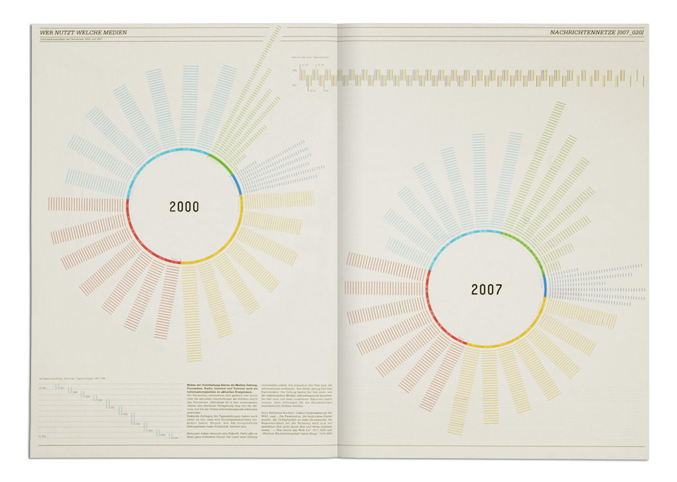
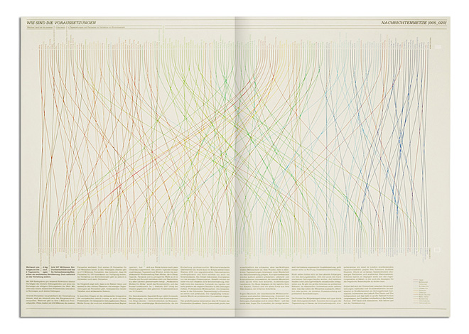
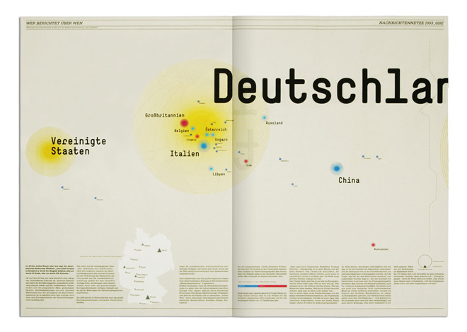
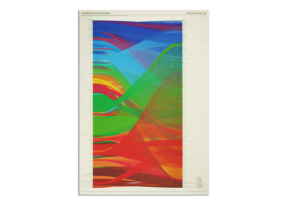
stefan brautigum:overnewsed but uninformed
:::::::::::::::::::::::::::::::::::::::::::::::::::::::::::::::::::::::::::::::::::::
http://www.overnewsed-but-uninformed.de
>>>>>>>>>>>>>>>>>>>>>>>>>>>>>>>>>>>>>>>>>>>>>>>>>>>>>>>>>>>>>>>>>>>>>>>>>>>>>>>>>>>>>>
http://www.visualcomplexity.com
:::::::::::::::::::::::::::::::::::::::::::::::::::::::::::::::::::::::::::::::::::::


 URL:
URL:
http://www.chrisharrison.net/projects/bibleviz/index.html Project Description:
::::::::::::::::::::::::::::::::::::::::::::::::::::::::::::::::::::::::::::::::::::::
This visualization started as a collaboration between Christoph Romhild and Chris Harrison. As Chris explains: "Christoph, a Lutheran Pastor, first emailed me in October of 2007. He described a data set he was putting together that defined textual cross references found in the Bible. He had already done considerable work visualizing the data before contacting me. Together, we struggled to find an elegant solution to render the data, more than 63,000 cross references in total. As work progressed, it became clear that an interactive visualization would be needed to properly explore the data, where users could zoom in and prune down the information to manageable levels. However, this was less interesting to us, as several Bible-exploration programs existed that offered similar functionality (and much more). Instead we set our sights on the other end of the spectrum - something more beautiful than functional. At the same time, we wanted something that honored and revealed the complexity of the data at every level - as one leans in, smaller details should become visible".
/////////////////////////////////////////////////////////////////////////////////////


/////////////////////////////////////////////////////////////////////////////////////


::::::::::::::::::::::::::::::::::::::::::::::::::::::::::::::::::::::::::::::::::::::
Author(s):
Oscar Karlin
Institution:
London College of Printing
Year:
2005
URL:
http://www.oskarlin.com/2005/11/29/time-travel
Project Description:
Time Travel was part of one of Oskar Karlin's final projects at London College of Printing (now London College of Communication). It started as an attempt to redesign the London Underground map. As Karlin puts it: "How could I come up with some innovative ideas to this piece of design that is by many considered as one of the best in graphic design ever"
Karlin started thinking on what's currently different in the world from when the map was designed, and pointed time as the key differentiator. As he explains: "Today you never tell anyone how far away in miles you live, but in minutes or perhaps hours if you're unlucky". Therefore, Karlin decided to create a re-design based on time instead of geographical distance.
Since Karlin's school was in Elephant & Castle, he used the station as time 0 and then created zones for each 5 minutes travel from Elephant & Castle. The idea is that the background is different on each station around the system.
The image shows the final map focused on Elephant & Castle with time zones. The scale in the bottom left is a time scale, in minutes. Each zone represents 5 minutes.
>>>>>>>>>>>>>>>>>>>>>>>>>>>>>>>>>>>>>>>>>>>>>>>>>>>>>>>>>>>>>>>>>>>>>>>>>>>>>>>>>>>>>
http://infosthetics.com information aesthetics.Where form follows data.
:::::::::::::::::::::::::::::::::::::::::::::::::::::::::::::::::::::::::::::::::::::


FFFFOUND BLOG
:::::::::::::::::::::::::::::::::::::::::::::::::::::::::::::::::::::::::::::::::::::::




::::::::::::::::::::::::::::::::::::::::::::::::::::::::::::::::::::::::::::::::::::::
DESIGNERS FOUND
::::::::::::::::::::::::::::::::::::::::::::::::::::::::::::::::::::::::::::::::::::::
stefan brautigum:overnewsed but uninformed
:::::::::::::::::::::::::::::::::::::::::::::::::::::::::::::::::::::::::::::::::::::
http://www.overnewsed-but-uninformed.de
>>>>>>>>>>>>>>>>>>>>>>>>>>>>>>>>>>>>>>>>>>>>>>>>>>>>>>>>>>>>>>>>>>>>>>>>>>>>>>>>>>>>>>
http://www.visualcomplexity.com
:::::::::::::::::::::::::::::::::::::::::::::::::::::::::::::::::::::::::::::::::::::


 URL:
URL:http://www.chrisharrison.net/projects/bibleviz/index.html Project Description:
::::::::::::::::::::::::::::::::::::::::::::::::::::::::::::::::::::::::::::::::::::::
This visualization started as a collaboration between Christoph Romhild and Chris Harrison. As Chris explains: "Christoph, a Lutheran Pastor, first emailed me in October of 2007. He described a data set he was putting together that defined textual cross references found in the Bible. He had already done considerable work visualizing the data before contacting me. Together, we struggled to find an elegant solution to render the data, more than 63,000 cross references in total. As work progressed, it became clear that an interactive visualization would be needed to properly explore the data, where users could zoom in and prune down the information to manageable levels. However, this was less interesting to us, as several Bible-exploration programs existed that offered similar functionality (and much more). Instead we set our sights on the other end of the spectrum - something more beautiful than functional. At the same time, we wanted something that honored and revealed the complexity of the data at every level - as one leans in, smaller details should become visible".
This process ultimately led them to the multi-colored arc diagram shown here. The bar graph that runs along the bottom represents all of the chapters in the Bible. Books alternate in color between white and light gray. The length of each bar denotes the number of verses in the chapter. Each of the 63,779 cross references found in the Bible is depicted by a single arc - the color corresponds to the distance between the two chapters, creating a rainbow-like effect.
/////////////////////////////////////////////////////////////////////////////////////


/////////////////////////////////////////////////////////////////////////////////////


::::::::::::::::::::::::::::::::::::::::::::::::::::::::::::::::::::::::::::::::::::::
Author(s):
Oscar Karlin
Institution:
London College of Printing
Year:
2005
URL:
http://www.oskarlin.com/2005/11/29/time-travel
Project Description:
Time Travel was part of one of Oskar Karlin's final projects at London College of Printing (now London College of Communication). It started as an attempt to redesign the London Underground map. As Karlin puts it: "How could I come up with some innovative ideas to this piece of design that is by many considered as one of the best in graphic design ever"
Karlin started thinking on what's currently different in the world from when the map was designed, and pointed time as the key differentiator. As he explains: "Today you never tell anyone how far away in miles you live, but in minutes or perhaps hours if you're unlucky". Therefore, Karlin decided to create a re-design based on time instead of geographical distance.
Since Karlin's school was in Elephant & Castle, he used the station as time 0 and then created zones for each 5 minutes travel from Elephant & Castle. The idea is that the background is different on each station around the system.
The image shows the final map focused on Elephant & Castle with time zones. The scale in the bottom left is a time scale, in minutes. Each zone represents 5 minutes.
>>>>>>>>>>>>>>>>>>>>>>>>>>>>>>>>>>>>>>>>>>>>>>>>>>>>>>>>>>>>>>>>>>>>>>>>>>>>>>>>>>>>>
http://infosthetics.com information aesthetics.Where form follows data.
:::::::::::::::::::::::::::::::::::::::::::::::::::::::::::::::::::::::::::::::::::::


Wednesday, 15 October 2008
surfing/15th october/visualising information/
:::::::::::::::::::::::::::::::::::::::::::::::::::::::::::::::::::::::::::::::::::::::
Need to look at how designers have visualised information for collections brief
///////////////////////////////////////////////////////////////////////////////////////
THINGS TO CONSIDER
:::::::::::::::::::::::::::::::::::::::::::::::::::::::::::::::::::::::::::::::::::::::
-Catalogues
-Hierarchy of type
-Collections
-Categorisation
-Visualisig quantative information
-Visualising qualitive information
///////////////////////////////////////////////////////////////////////////////////////
POSSIBLE STARTING POINTS
:::::::::::::::::::::::::::::::::::::::::::::::::::::::::::::::::::::::::::::::::::::::
-BOOK:Data Flow - visualising information
-BOOK:Visual research
-DESIGNER:Tufte
///////////////////////////////////////////////////////////////////////////////////////
BOOK:DATA FLOW
::::::::::::::::::::::::::::::::::::::::::::::::::::::::::::::::::::::::::::::::::::::
PUBLISHER:DIE GESTALTEN VERLAG
DESIGNER:ONLAB(http://www.onlab.ch/)
//////////////////////////////////////////////////////////////////////////////////////


::::::::::::::::::::::::::::::::::::::::::::::::::::::::::::::::::::::::::::::::::::::
DESIGNERS EXTRACTED FROM WHAT I CAN SEE IN THESE IMAGES
::::::::::::::::::::::::::::::::::::::::::::::::::::::::::::::::::::::::::::::::::::::
-LUST
-MARIA TACKMANN
-THANKS EVERYBODY
-TOKO
-SUSAN TREISTER
-STUDIO 8 DESIGN
-STRUKT DESIGN STUDIO
-STAMEN
-MARIUS WATZ
-WELCOME TO.AS
-ALAN WOO
-MARTIN WOODTLI
-WORLD MAPPER
>>>>>>>>>>>>>>>>>>>>>>>>>>>>>>>>>>>>>>>>>>>>>>>>>>>>>>>>>>>>>>>>>>>>>>>>>>>>>>>>>>>>>
JAKE HOBART:http://www.thankseverybody.com
DESigner based in new york did an MA at St.martins.
:::::::::::::::::::::::::::::::::::::::::::::::::::::::::::::::::::::::::::::::::::::
Final project for my MA at Central Saint Martins. It is a project about the how we track weather, the rain in particular. For a 4 week period the rain was measured by the actions that make up my life.
The final presentation takes the form of a series of 12 books. Each book folds out to create a perfect circle. The books form concentric circles, the largest being 1.75 meters across.
:::::::::::::::::::::::::::::::::::::::::::::::::::::::::::::::::::::::::::::::::::::
Stage #1: Data Collection
Okay, Stage #1. For a period of 4 weeks life revolves around the rain. Data was collected from 15th January - 11th February. Three types of data were collected: Recorded, Observed, and Recounted. The different
collection methods are explained breifly below. Each stems from a specific strain of research, which might someday be explained here. The competitor data sources are also explained.
Recorded: My data
Put simply, if rain is present I am unhealthy, if it is not I am healthy. The rain determines all decisions regarding health. This covers decisions about food, exercise, transport, and smoking/drinking. Weight and BMI (body mass index) are recorded at 8 am every morning, and an image is taken to show visible progress.
Examples of data
Recorded: Their Data
The actual rainfall measurements taken at 15 minute interval at the Crouch End Weather Station.
view site
Sample graph
Observed: My Data
Observed data is the simplest type of data. It is the weather that we experience. Coming in contact with the weather allows one to say, without a doubt, that a certain type of weather took place.
Data is series of photographs of the sky
Observed: Their Data
Radar images taken from the Met Office site. Updated every hour. Radar image colors changed because of atrociousness.
view site
Composite radar image
Recounted: My Data
Recounted data is a written recollection of the weather for the day. It forgoes instrumental data, instead using plain english to explain what occured meteorologically during the day.
Example diary page
Recounted: Their Data
The Met Office keeps a little diary of themselves, not very extensive, but it is a text-based recounting of the weather.
:::::::::::::::::::::::::::::::::::::::::::::::::::::::::::::::::::::::::::::::::::::
Stage #2: Data Presentation
The final presentation takes the form of a series of books. There are 12. There is 1 book per data type (3), per week (4), 3×4=12. Each book folds out to create perfect circle. The three data types form concentric
circles, the largest being the recorded data which measures 1.75 meters across.
All 12 books. The 3 different data types going across, and the 4 weeks going down.
Right: Covers from one week.
Below: Spreads from a day.
Spread from recorded data book.
Spread from observed data book.
Spread from recounted data book.
Right: Broken spine so books can be opened to create a perfect 1.7 meter circle.
Below: Books opened up and put on wall.
:::::::::::::::::::::::::::::::::::::::::::::::::::::::::::::::::::::::::::::::::::::
Carrol Livingston Riker
A true hero in the history of big things. A true hero to young Jake Hobart.
Carrol set out to make the world a better place, an admirable task. Among many grandious plans to do this lies his unfinished masterpiece. A 200 mile long jetty spanning the North Sea. The jetty would halt the icy cold Labrador current coming from the arctic. The Labrador current is famous for meeting up with the jet stream and shooting it easterly. With the Labrador current blocked by a massive jetty the Jet Stream is free to roll up further north, melting the ice caps of Greenland, then on to create fertile farmlands across Scandanavia and then into northern Russia and Siberia, while changed the rotation of the earth as well.
Jetty location
Lewis Fry Richardson
"for it was thought that those who compute the weather should breathe of it freely"
Lewis is smarter than you. Lewis was a pacifist, so while serving during the WWI he was assigned to ambulance duty. He sat and looked at the sky, and started writing a formula to predict the weather. It spans hundreds of pages. In 1922 it was published. It is still in use today.
Diagrams from a meteorological revolution
Other Meteorological Eccentrics
George James Symons, James Pollard Espy, Luke Howard, Ellsworth Huntington, etc. No flashy clothes, no indie rock, no big sunglasses, no squirrely movements, just fine suits and big thoughts.
Luke, James, George, Ellsworth
Weather Diaries
Before the use of instruments to collect data on weather, personal weather diaries were used. Often times kept by non-professionals these were a curious form of recording. Facts about weather such as wind speed, barometric pressure, rainfall, etc. are sometime interspersed with personal reflections, stories about livestock, town gossip, and other interesting pieces of non-weather realated information.
Weather Modification
So much to say. Vietnam. HAARP. Terraforming. China. Silver Iodide. Warfare. Vladamir Putin. Etc. One of the most interesting and controversial topics you could ever come across.
Laki Volcano
The eruption in 1783 causes interesting meteorological phenomena that in turn created interest in meteorology, which created a young new breed of passionate meteorologists.
People
Just walking around and seeing people in the rain.
Hatred for Umbrellas
I hate them more than Bono.
:::::::::::::::::::::::::::::::::::::::::::::::::::::::::::::::::::::::::::::::::::::

/////////////////////////////////////////////////////////////////////////////////////
WENT TO WATERSTONES TO LOOK THROUGH BOOK AND GET MORE NAMES
:::::::::::::::::::::::::::::::::::::::::::::::::::::::::::::::::::::::::::::::::::::
-JOOST GROTENS
-SHAHEE ILYAS
-SOCKET STUDIOS
-JEFFERY DOCHERTY
-ANDREAS NICOLAS FISCHER
-VALENTIN ADAM
-BENOIT LEMOINE
-JESSICA HAGY
-TOBIAS NUSSER & TOM ZIORA
-EFFEKTIVE
-TIMM KEKERITZ
-BURO X WERNER SINGER FELIX HEINEN
-CATALOGTREE
-LORENZO GEIGER
-BARBARA HAHN
-CHRIS CAMPBELL
>>>>>>>>>>>>>>>>>>>>>>>>>>>>>>>>>>>>>>>>>>>>>>>>>>>>>>>>>>>>>>>>>>>>>>>>>>>>>>>>>>>>>
BARBARA HAHN
_http://www.barbarahahn.com/
:::::::::::::::::::::::::::::::::::::::::::::::::::::::::::::::::::::::::::::::::::::


:::::::::::::::::::::::::::::::::::::::::::::::::::::::::::::::::::::::::::::::::::::
NOTES
-Use of photography to collect data
-Photography used to create vector. Vector simplifies image down to what is important.
which visualises the information with more clarity. The vector also highlights volume.
/////////////////////////////////////////////////////////////////////////////////////
CATALOGTREE
_http://catalogtree.net
:::::::::::::::::::::::::::::::::::::::::::::::::::::::::::::::::::::::::::::::::::::


/////////////////////////////////////////////////////////////////////////////////////
BENOIT LEMOINE
_http://www.lemoinebenoit.eu/
:::::::::::::::::::::::::::::::::::::::::::::::::::::::::::::::::::::::::::::::::::::

/////////////////////////////////////////////////////////////////////////////////////
VALENTINE ADAM
_http://www.spvz.net
:::::::::::::::::::::::::::::::::::::::::::::::::::::::::::::::::::::::::::::::::::::


/////////////////////////////////////////////////////////////////////////////////////
ANDREAS NICOLAS FISCHER
_http://dasautomat.com
:::::::::::::::::::::::::::::::::::::::::::::::::::::::::::::::::::::::::::::::::::::


/////////////////////////////////////////////////////////////////////////////////////
JOOST GROOTENS
_http://www.grootens.nl
:::::::::::::::::::::::::::::::::::::::::::::::::::::::::::::::::::::::::::::::::::::


Need to look at how designers have visualised information for collections brief
///////////////////////////////////////////////////////////////////////////////////////
THINGS TO CONSIDER
:::::::::::::::::::::::::::::::::::::::::::::::::::::::::::::::::::::::::::::::::::::::
-Catalogues
-Hierarchy of type
-Collections
-Categorisation
-Visualisig quantative information
-Visualising qualitive information
///////////////////////////////////////////////////////////////////////////////////////
POSSIBLE STARTING POINTS
:::::::::::::::::::::::::::::::::::::::::::::::::::::::::::::::::::::::::::::::::::::::
-BOOK:Data Flow - visualising information
-BOOK:Visual research
-DESIGNER:Tufte
///////////////////////////////////////////////////////////////////////////////////////
BOOK:DATA FLOW
::::::::::::::::::::::::::::::::::::::::::::::::::::::::::::::::::::::::::::::::::::::
PUBLISHER:DIE GESTALTEN VERLAG
DESIGNER:ONLAB(http://www.onlab.ch/)
//////////////////////////////////////////////////////////////////////////////////////


::::::::::::::::::::::::::::::::::::::::::::::::::::::::::::::::::::::::::::::::::::::
DESIGNERS EXTRACTED FROM WHAT I CAN SEE IN THESE IMAGES
::::::::::::::::::::::::::::::::::::::::::::::::::::::::::::::::::::::::::::::::::::::
-LUST
-MARIA TACKMANN
-THANKS EVERYBODY
-TOKO
-SUSAN TREISTER
-STUDIO 8 DESIGN
-STRUKT DESIGN STUDIO
-STAMEN
-MARIUS WATZ
-WELCOME TO.AS
-ALAN WOO
-MARTIN WOODTLI
-WORLD MAPPER
>>>>>>>>>>>>>>>>>>>>>>>>>>>>>>>>>>>>>>>>>>>>>>>>>>>>>>>>>>>>>>>>>>>>>>>>>>>>>>>>>>>>>
JAKE HOBART:http://www.thankseverybody.com
DESigner based in new york did an MA at St.martins.
:::::::::::::::::::::::::::::::::::::::::::::::::::::::::::::::::::::::::::::::::::::
Final project for my MA at Central Saint Martins. It is a project about the how we track weather, the rain in particular. For a 4 week period the rain was measured by the actions that make up my life.
The final presentation takes the form of a series of 12 books. Each book folds out to create a perfect circle. The books form concentric circles, the largest being 1.75 meters across.
:::::::::::::::::::::::::::::::::::::::::::::::::::::::::::::::::::::::::::::::::::::
Stage #1: Data Collection
Okay, Stage #1. For a period of 4 weeks life revolves around the rain. Data was collected from 15th January - 11th February. Three types of data were collected: Recorded, Observed, and Recounted. The different
collection methods are explained breifly below. Each stems from a specific strain of research, which might someday be explained here. The competitor data sources are also explained.
Recorded: My data
Put simply, if rain is present I am unhealthy, if it is not I am healthy. The rain determines all decisions regarding health. This covers decisions about food, exercise, transport, and smoking/drinking. Weight and BMI (body mass index) are recorded at 8 am every morning, and an image is taken to show visible progress.
Examples of data
Recorded: Their Data
The actual rainfall measurements taken at 15 minute interval at the Crouch End Weather Station.
view site
Sample graph
Observed: My Data
Observed data is the simplest type of data. It is the weather that we experience. Coming in contact with the weather allows one to say, without a doubt, that a certain type of weather took place.
Data is series of photographs of the sky
Observed: Their Data
Radar images taken from the Met Office site. Updated every hour. Radar image colors changed because of atrociousness.
view site
Composite radar image
Recounted: My Data
Recounted data is a written recollection of the weather for the day. It forgoes instrumental data, instead using plain english to explain what occured meteorologically during the day.
Example diary page
Recounted: Their Data
The Met Office keeps a little diary of themselves, not very extensive, but it is a text-based recounting of the weather.
:::::::::::::::::::::::::::::::::::::::::::::::::::::::::::::::::::::::::::::::::::::
Stage #2: Data Presentation
The final presentation takes the form of a series of books. There are 12. There is 1 book per data type (3), per week (4), 3×4=12. Each book folds out to create perfect circle. The three data types form concentric
circles, the largest being the recorded data which measures 1.75 meters across.
All 12 books. The 3 different data types going across, and the 4 weeks going down.
Right: Covers from one week.
Below: Spreads from a day.
Spread from recorded data book.
Spread from observed data book.
Spread from recounted data book.
Right: Broken spine so books can be opened to create a perfect 1.7 meter circle.
Below: Books opened up and put on wall.
:::::::::::::::::::::::::::::::::::::::::::::::::::::::::::::::::::::::::::::::::::::
Carrol Livingston Riker
A true hero in the history of big things. A true hero to young Jake Hobart.
Carrol set out to make the world a better place, an admirable task. Among many grandious plans to do this lies his unfinished masterpiece. A 200 mile long jetty spanning the North Sea. The jetty would halt the icy cold Labrador current coming from the arctic. The Labrador current is famous for meeting up with the jet stream and shooting it easterly. With the Labrador current blocked by a massive jetty the Jet Stream is free to roll up further north, melting the ice caps of Greenland, then on to create fertile farmlands across Scandanavia and then into northern Russia and Siberia, while changed the rotation of the earth as well.
Jetty location
Lewis Fry Richardson
"for it was thought that those who compute the weather should breathe of it freely"
Lewis is smarter than you. Lewis was a pacifist, so while serving during the WWI he was assigned to ambulance duty. He sat and looked at the sky, and started writing a formula to predict the weather. It spans hundreds of pages. In 1922 it was published. It is still in use today.
Diagrams from a meteorological revolution
Other Meteorological Eccentrics
George James Symons, James Pollard Espy, Luke Howard, Ellsworth Huntington, etc. No flashy clothes, no indie rock, no big sunglasses, no squirrely movements, just fine suits and big thoughts.
Luke, James, George, Ellsworth
Weather Diaries
Before the use of instruments to collect data on weather, personal weather diaries were used. Often times kept by non-professionals these were a curious form of recording. Facts about weather such as wind speed, barometric pressure, rainfall, etc. are sometime interspersed with personal reflections, stories about livestock, town gossip, and other interesting pieces of non-weather realated information.
Weather Modification
So much to say. Vietnam. HAARP. Terraforming. China. Silver Iodide. Warfare. Vladamir Putin. Etc. One of the most interesting and controversial topics you could ever come across.
Laki Volcano
The eruption in 1783 causes interesting meteorological phenomena that in turn created interest in meteorology, which created a young new breed of passionate meteorologists.
People
Just walking around and seeing people in the rain.
Hatred for Umbrellas
I hate them more than Bono.
:::::::::::::::::::::::::::::::::::::::::::::::::::::::::::::::::::::::::::::::::::::

/////////////////////////////////////////////////////////////////////////////////////
WENT TO WATERSTONES TO LOOK THROUGH BOOK AND GET MORE NAMES
:::::::::::::::::::::::::::::::::::::::::::::::::::::::::::::::::::::::::::::::::::::
-JOOST GROTENS
-SHAHEE ILYAS
-SOCKET STUDIOS
-JEFFERY DOCHERTY
-ANDREAS NICOLAS FISCHER
-VALENTIN ADAM
-BENOIT LEMOINE
-JESSICA HAGY
-TOBIAS NUSSER & TOM ZIORA
-EFFEKTIVE
-TIMM KEKERITZ
-BURO X WERNER SINGER FELIX HEINEN
-CATALOGTREE
-LORENZO GEIGER
-BARBARA HAHN
-CHRIS CAMPBELL
>>>>>>>>>>>>>>>>>>>>>>>>>>>>>>>>>>>>>>>>>>>>>>>>>>>>>>>>>>>>>>>>>>>>>>>>>>>>>>>>>>>>>
BARBARA HAHN
_http://www.barbarahahn.com/
:::::::::::::::::::::::::::::::::::::::::::::::::::::::::::::::::::::::::::::::::::::


:::::::::::::::::::::::::::::::::::::::::::::::::::::::::::::::::::::::::::::::::::::
NOTES
-Use of photography to collect data
-Photography used to create vector. Vector simplifies image down to what is important.
which visualises the information with more clarity. The vector also highlights volume.
/////////////////////////////////////////////////////////////////////////////////////
CATALOGTREE
_http://catalogtree.net
:::::::::::::::::::::::::::::::::::::::::::::::::::::::::::::::::::::::::::::::::::::


/////////////////////////////////////////////////////////////////////////////////////
BENOIT LEMOINE
_http://www.lemoinebenoit.eu/
:::::::::::::::::::::::::::::::::::::::::::::::::::::::::::::::::::::::::::::::::::::

/////////////////////////////////////////////////////////////////////////////////////
VALENTINE ADAM
_http://www.spvz.net
:::::::::::::::::::::::::::::::::::::::::::::::::::::::::::::::::::::::::::::::::::::


/////////////////////////////////////////////////////////////////////////////////////
ANDREAS NICOLAS FISCHER
_http://dasautomat.com
:::::::::::::::::::::::::::::::::::::::::::::::::::::::::::::::::::::::::::::::::::::


/////////////////////////////////////////////////////////////////////////////////////
JOOST GROOTENS
_http://www.grootens.nl
:::::::::::::::::::::::::::::::::::::::::::::::::::::::::::::::::::::::::::::::::::::


Subscribe to:
Posts (Atom)